Biro Bravado: The Glorious Mess of Britain's Homemade Record Sleeve Tradition
Pick up almost any major label release from the last decade and you'll find the same thing: a beautifully lit photograph, tastefully chosen typography, a colour palette that's been focus-grouped to within an inch of its life. Everything considered. Everything controlled. Everything, in a word, safe.
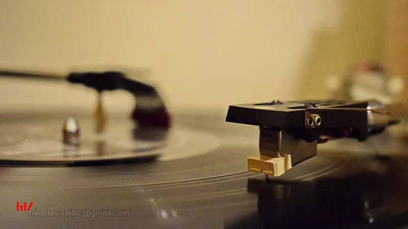
Now go and dig through a box of seven-inches at a record fair in Walsall or Wakefield or Wolverhampton. Find the ones with the hand-drawn lettering. The ones where the photocopier has smeared half the image into abstraction. The ones where someone has clearly used a biro, a ruler, and a lot of optimism. Those are the ones worth turning over.
A Tradition Built on Necessity and Defiance
Britain's DIY sleeve tradition didn't emerge from an aesthetic manifesto. It emerged from having no money and no access to professional design. When the post-punk explosion ripped through the UK in the late seventies and early eighties, the bands releasing music on tiny independent labels couldn't afford graphic designers. So they did it themselves, badly and brilliantly, with whatever was to hand.
The results were extraordinary. Not despite the limitations but because of them. A sleeve knocked together on a photocopier in someone's mum's office carried a visual energy that no amount of professional polish could replicate. It looked like it meant something. It looked urgent. It looked like the music inside was probably going to be a bit of a handful.
That's not accidental. The aesthetic and the attitude were always the same thing.
The Fanzine Inheritance
You can't talk about British DIY sleeve design without acknowledging its spiritual parent: the fanzine. The cut-and-paste visual language of seventies and eighties UK music fanzines — ransom note typography, hand-drawn illustrations, deliberately lo-fi reproduction — fed directly into the way underground records looked.
Labels like Fast Product, Rough Trade in its earliest incarnation, and dozens of even smaller regional operations understood, consciously or otherwise, that the packaging was part of the statement. A sleeve that looked like it had been assembled by someone who'd had enough of being told what proper design looked like was already making an argument before you'd heard a single note.
This is a specifically British thing, by the way. There's something in the national character — the love of the amateur, the suspicion of too much polish, the instinct to be a bit awkward about anything that seems too slick — that makes this tradition feel entirely natural here.
What a Mess Tells You
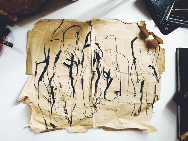
Here's the thing about genuinely chaotic DIY artwork: it communicates information that professional design actively suppresses. A hand-drawn sleeve tells you the artist made this themselves, or had a mate do it. It tells you the budget was basically nothing. It tells you nobody in a marketing meeting approved this image.
All of that is useful. All of that is honest. And in an era when even independent artists can access sophisticated design tools that make everything look polished and intentional, the deliberate refusal to use them carries a particular weight.
A cassette released last year by a Leeds-based noise project came in a sleeve that appeared to be a photocopied scan of a hand-drawn map of an industrial estate, overlaid with biro text that was partially illegible. It was, on any conventional measure, terrible design. It was also absolutely perfect. You knew immediately, from the sleeve alone, that whatever was inside was not going to be background music.
Bandcamp and the Beautiful Disaster
The DIY sleeve tradition has migrated online with surprising grace. Browse Bandcamp's weirder corners — the cassette labels, the one-person operations, the limited-run vinyl releases from bedroom producers — and you'll find the same visual energy that animated those post-punk seven-inches, now expressed through deliberately lo-fi digital art, scanned collages, hand-drawn covers photographed on kitchen tables.
Some of it is genuinely extraordinary. Some of it looks like it was made in fifteen minutes on a phone. Some of it is both simultaneously.
The point is that the refusal to conform to mainstream visual standards is still doing the same work it always did: signalling that this music exists outside the conventional economy of the music industry, that it was made on its own terms, and that it has absolutely no interest in your approval.
The Politics of Looking Rough
There's a political dimension to all of this that's worth naming directly. Mainstream music packaging — the expensive photography, the careful typography, the whole polished apparatus — is a product of money and access. It signals that the artist has industry backing, or at least industry-adjacent resources. It participates in a system of visual credibility that has always favoured certain kinds of music and certain kinds of musicians over others.
Deliberately amateurish artwork is, among other things, a refusal of that system. It says: we don't need your validation, and we're not going to pretend we do by mimicking your visual language. We're going to make something that looks like what it is — music made outside the mainstream, for people who know how to find it.
That's not poverty. That's a position.
Long Live the Biro
If you're a musician reading this and you're agonising over your Canva template or your Photoshop layers, consider the alternative. Get a biro. Find a photocopier. Make something that looks like it was made by a human being with something to say and not enough time to say it neatly.
Britain's underground has always looked a bit rough around the edges. That's not a bug. That's the whole point.